Brand Guidelines
Techdollar operates at the intersection of frontier technology and structured finance. The brand reflects that. Precise, restrained, and built to hold weight. These guidelines ensure consistent representation across all surfaces.
Guidelines
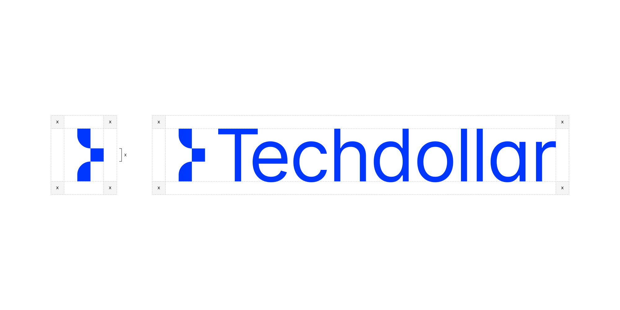
The correct spelling is Techdollar. One word, capital T, lowercase d. Always sentence case. Not "Tech Dollar", "TechDollar", "techdollar", "TECHDOLLAR", or "tech_dollar".
Spacing
Maintain clear space around the Techdollar logomark and wordmark to ensure visual balance and prevent crowding with text or other elements.
Contrast
Use light versions on dark backgrounds and dark versions on light backgrounds to maintain legibility and visual impact.

Partners
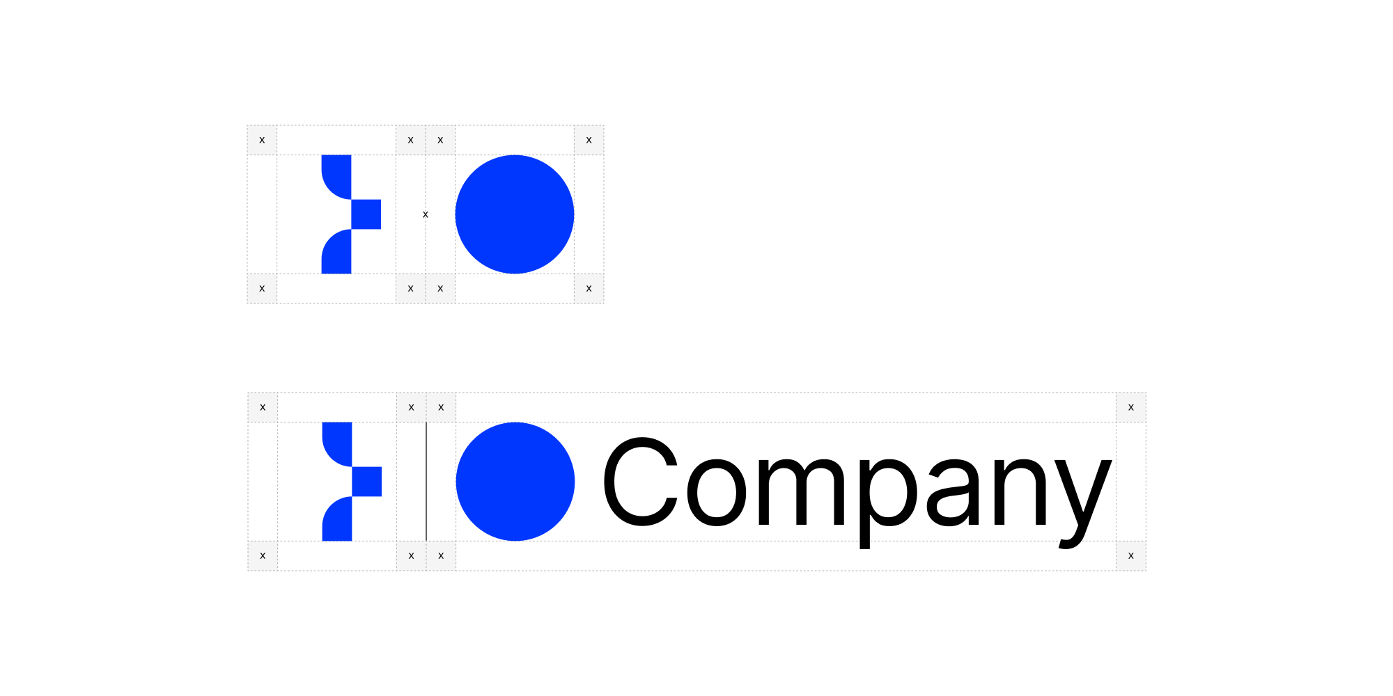
When co-branding, the Techdollar lockup should maintain clear space and proper alignment relative to partner marks. Use a vertical divider between logos.
Misuse
To maintain brand consistency, avoid the following modifications. Assets should be used as-is to ensure Techdollar's identity stays sharp and consistent.
- Do not apply gradients
- Do not add outlines or strokes
- Do not stretch or distort
- Do not rotate
- Do not add drop shadows
- Do not change the typeface
- Do not modify the logomark
- Do not rearrange components
Colors
Blue is the primary brand color. Black and white form the foundation. Gray is used sparingly for hierarchy and structure. The palette should never clash with or overpower partner brands in co-branded contexts.
Typography
Techdollar uses Geist Sans for all type across product and marketing. Geist Mono is used for code and data.
npm install geistAssets
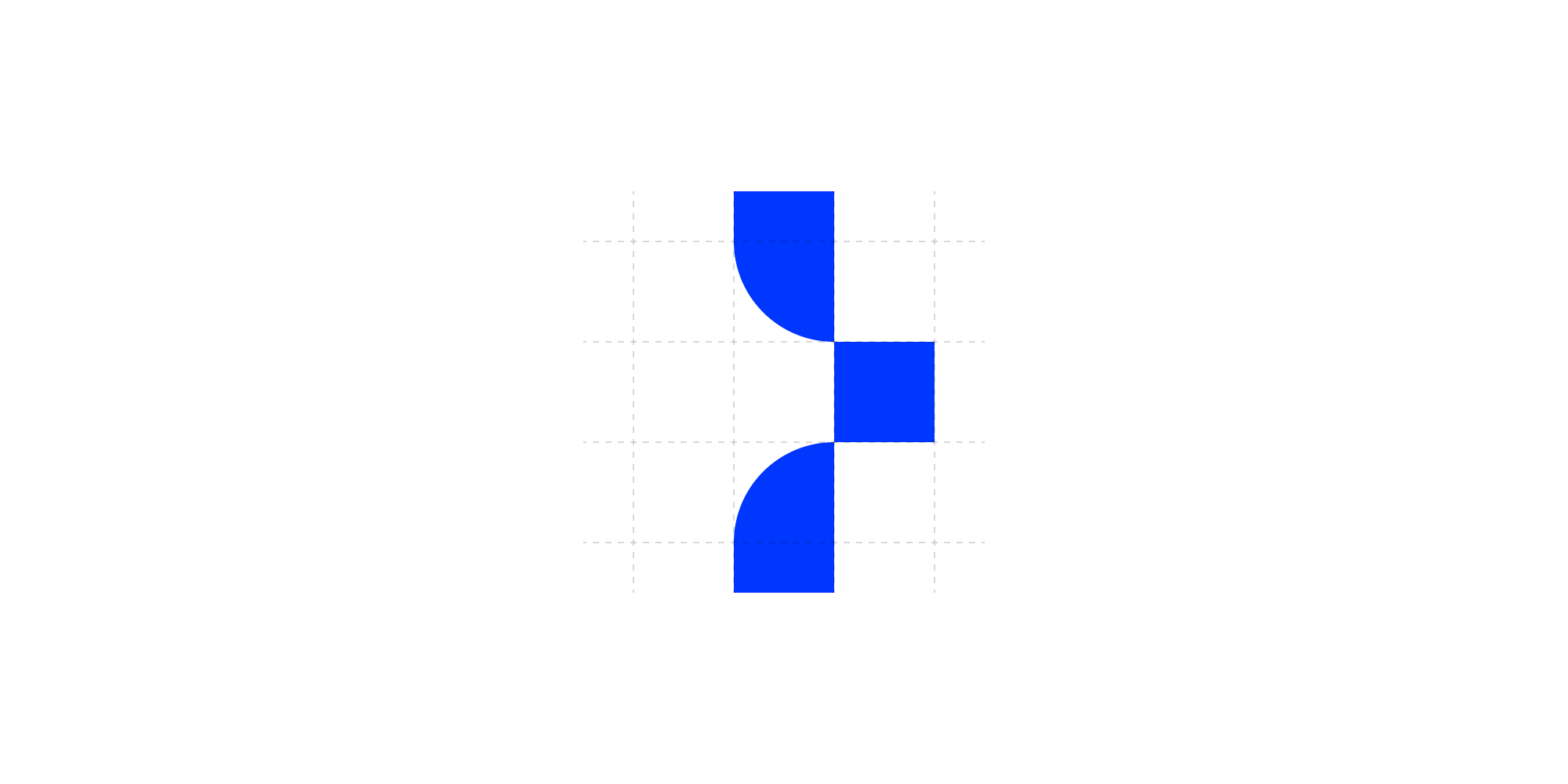
Logo
Logomark


Press
For press inquiries, interviews, or brand guidance, reach out to press@usd.tech